👩🏻💻🪄
I’m currently open to Full-Time Opportunities. Let’s make scroll-stopping magic together.
© 2025 | built by Rutal at 2AM, fueled by inspiration and pixel perfectionism — because who needs sleep when coffee exists?
Behance
I design. You need stuff designed.
I think not.
Coincidence?
My role
Branding
Brand Collaterals
Client
Kapil Kamrani
Interior Design Consultancy
Tools
Adobe Illustrator
Adobe Photoshop
Timeline
Project Type
2 weeks
Nov 2023
Individual
progression
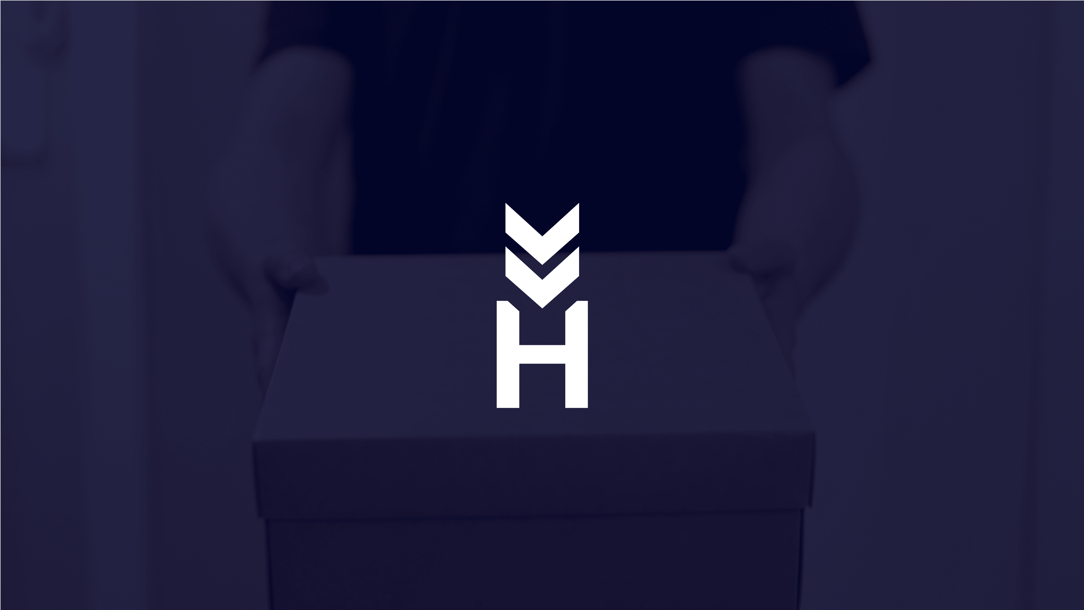
hands
box (package)
INITIAL PHASE
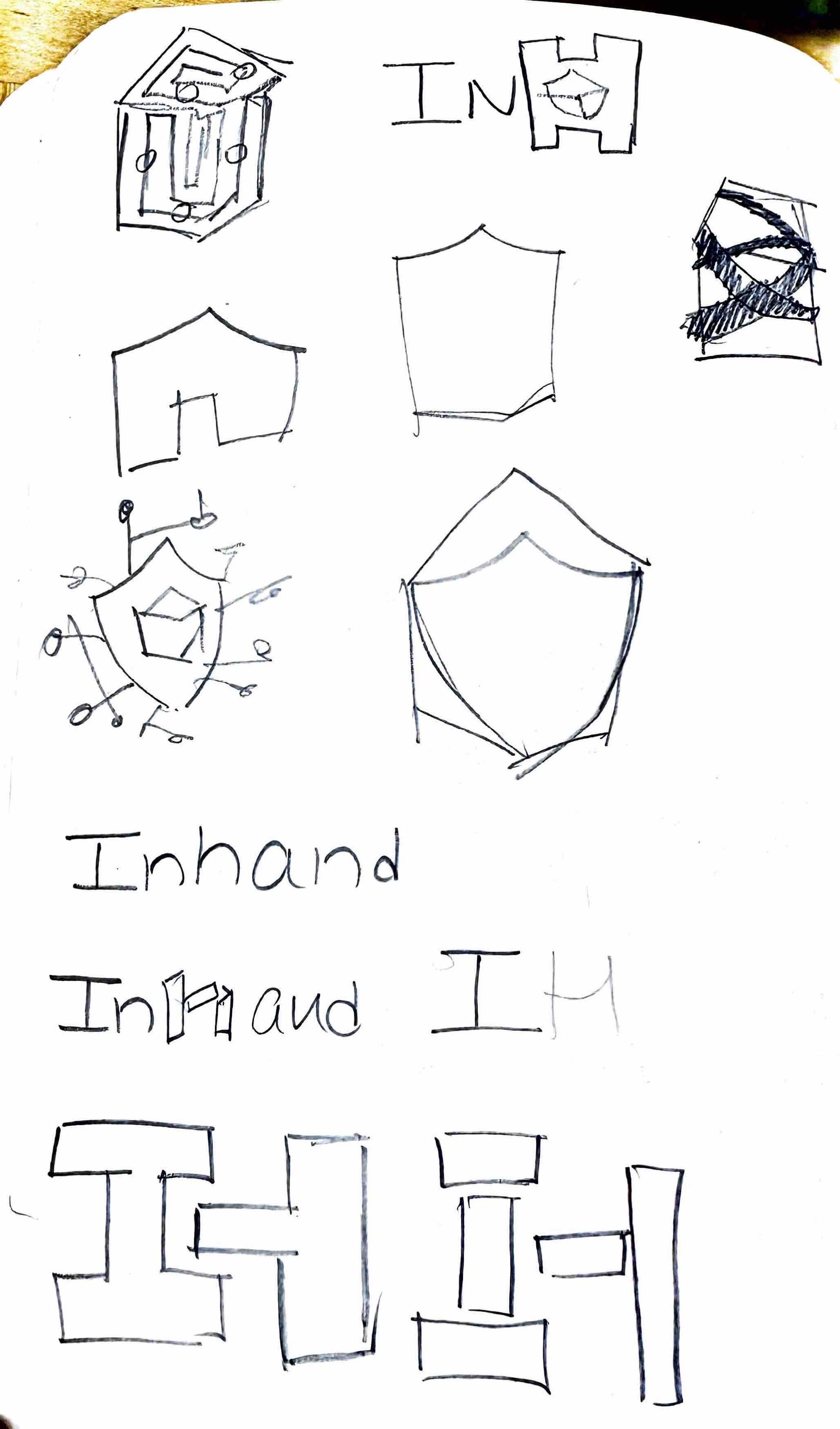
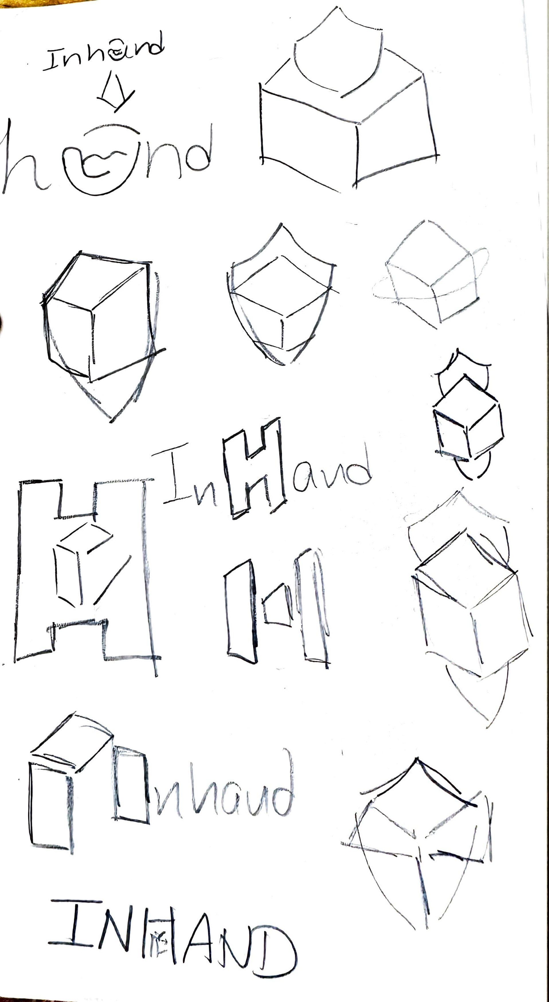
EXPLORATION PHASE
FINAL DESIGN
Keywords & Moodboard
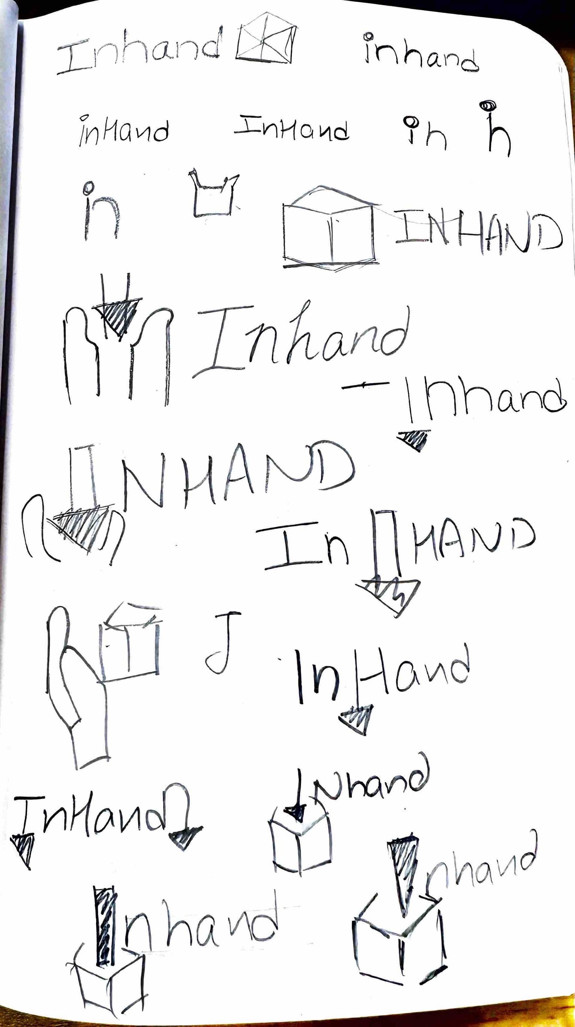
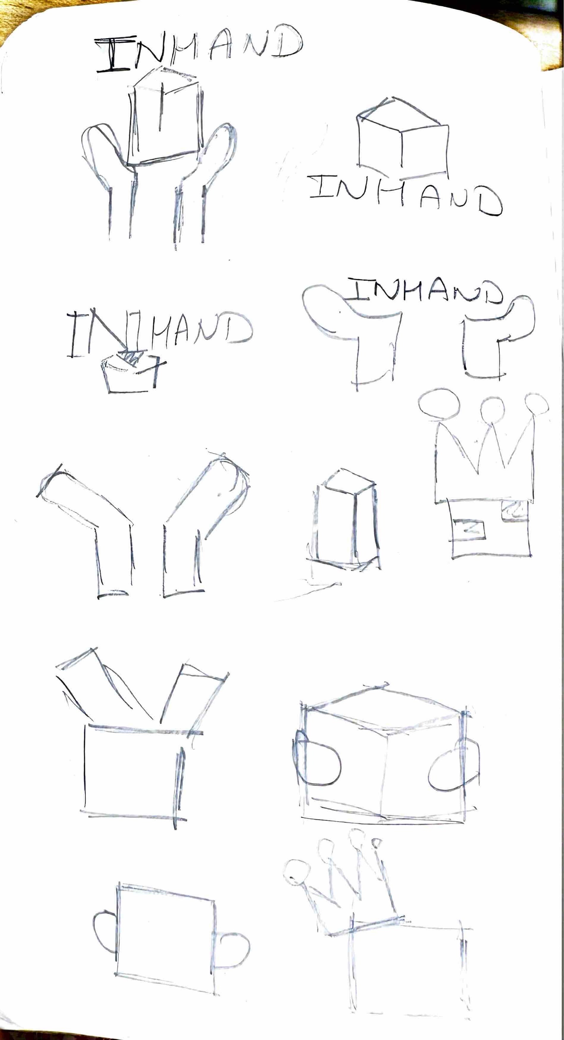
Ideation sketches
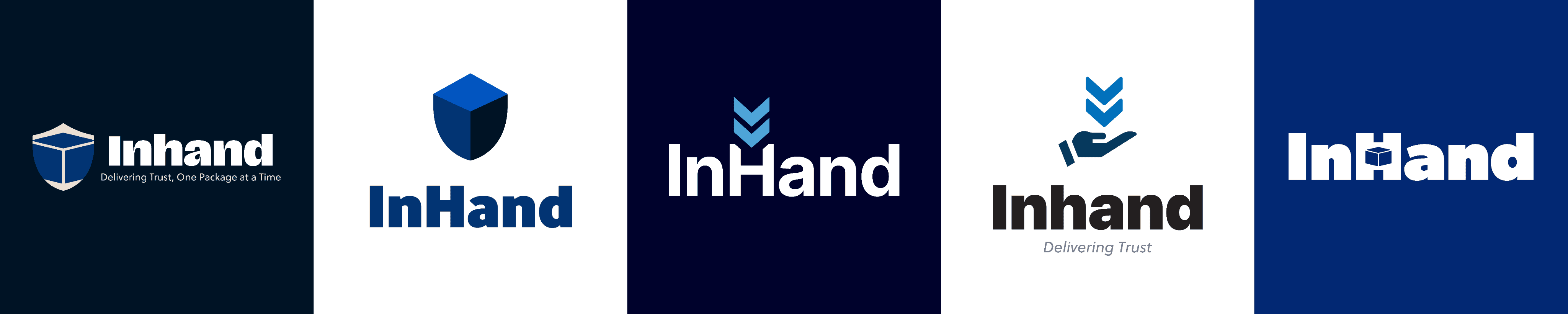
Selected Logo
Design exploration
#00022C
#4EA5D8
#0454AF
#C3DFF4
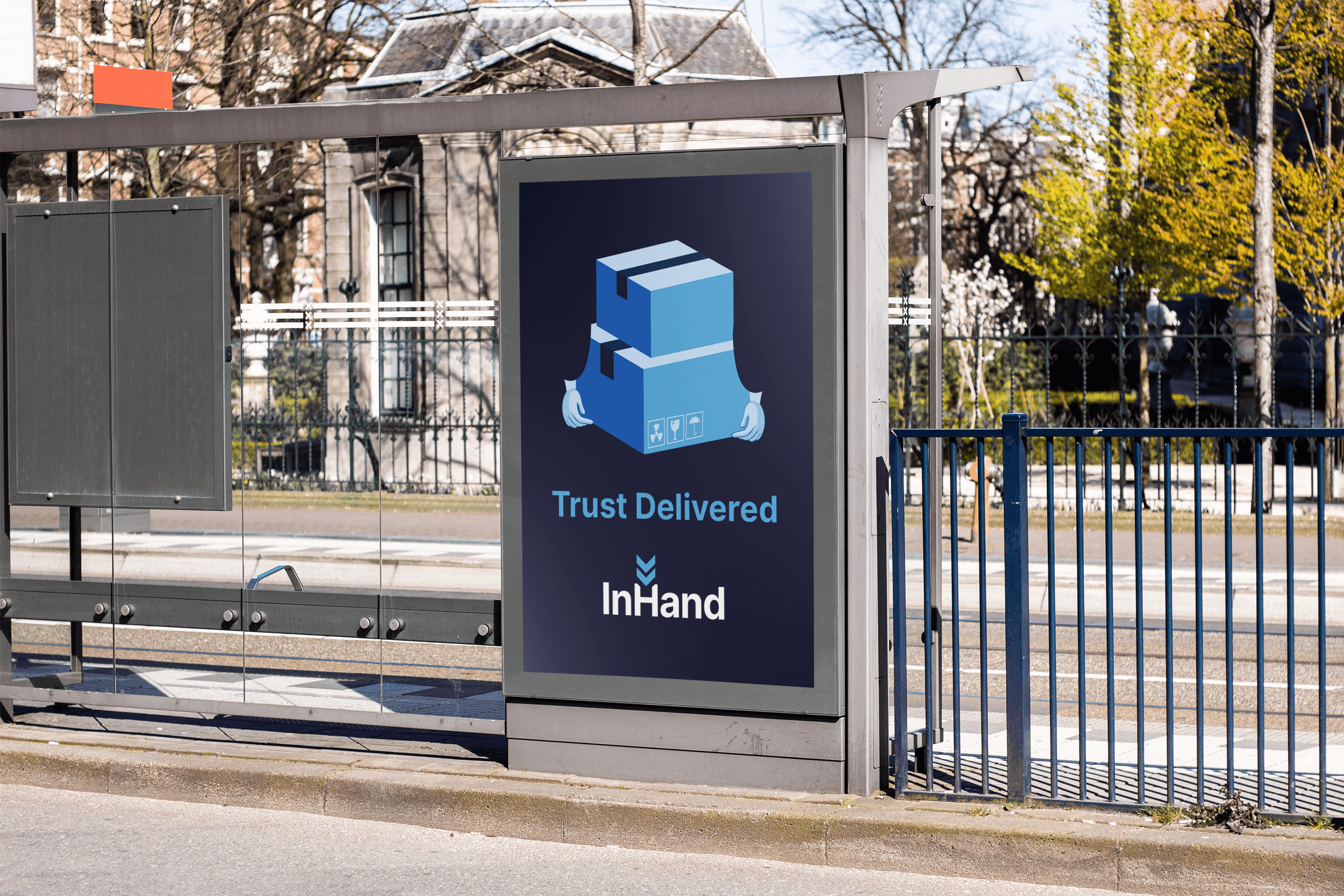
The logo brings together three key elements that reflect the brand’s values and purpose. The double arrows represent progression and flow, symbolizing the seamless journey from dispatch to delivery. The central shapes resemble open hands, highlighting the human-centered aspect of the service—care, trust, and responsible handling. The final U-shaped form represents a secure package or box, evoking reliability and safe delivery. Together, these elements create a cohesive visual story of trust, transparency, and thoughtful delivery—capturing both the efficiency of logistics and the emotional reassurance of knowing your package is in safe hands.
Inter
Regular, Semibold, Bold
Aa
0123

Secure
Modern
Reliable
Trustworthy
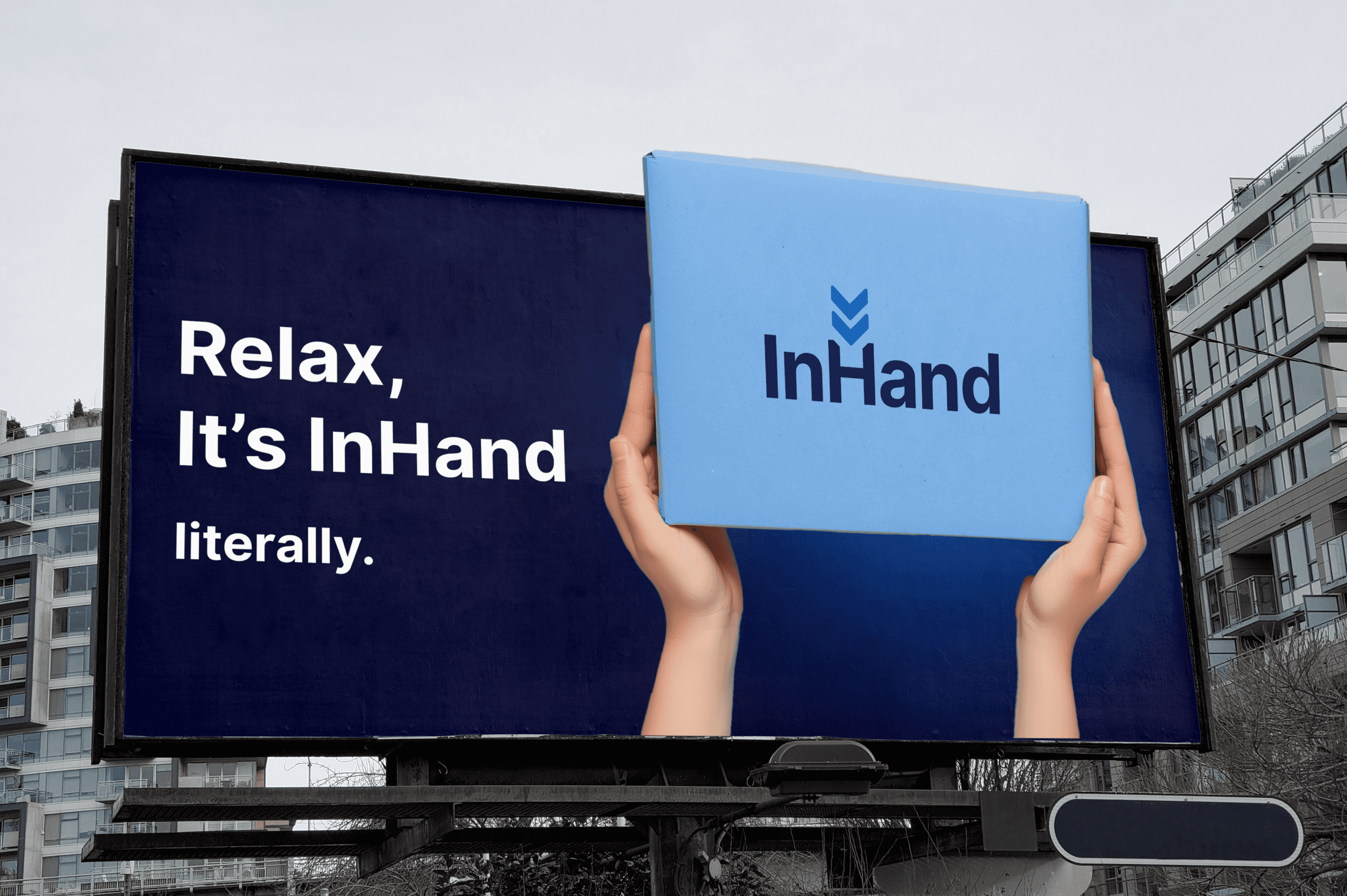
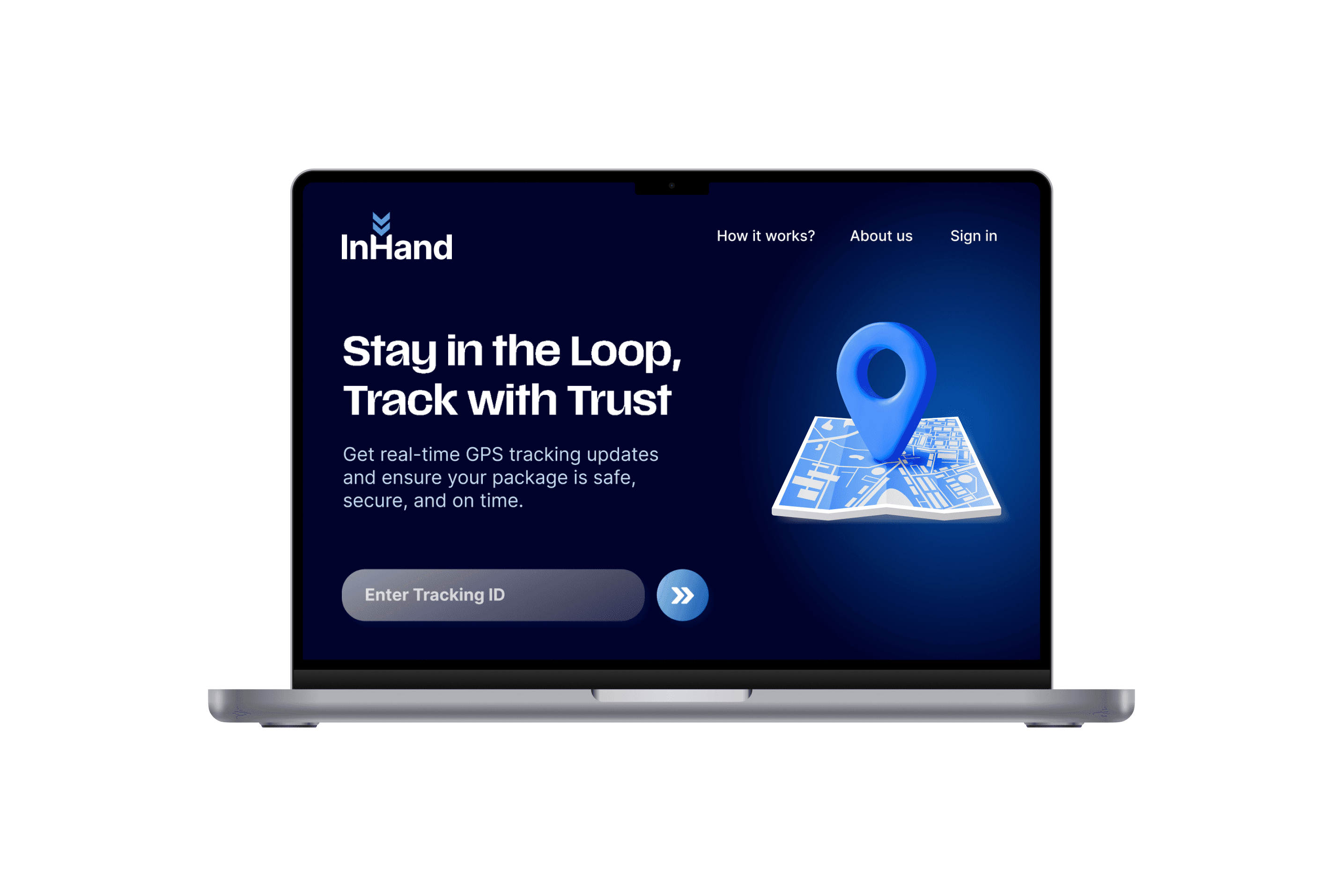
InHand
Redefining delivery through
transparency and reliability
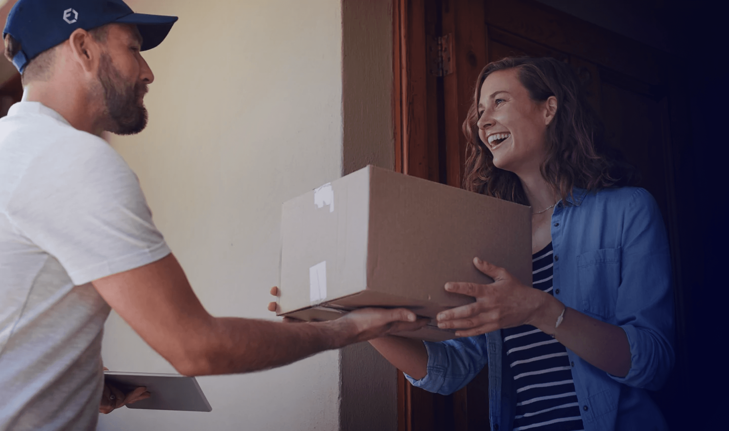
InHand is a mobile application designed for users to secure their packages by providing real-time tracking, accurate arrival times,
and exceptional reliability. The app eliminates the anxiety of waiting for important packages, offering seamless updates and on-time deliveries. This project captures the essence of InHand’s mission: to deliver not just packages, but trust — every time.


InHand - Visual Identity